


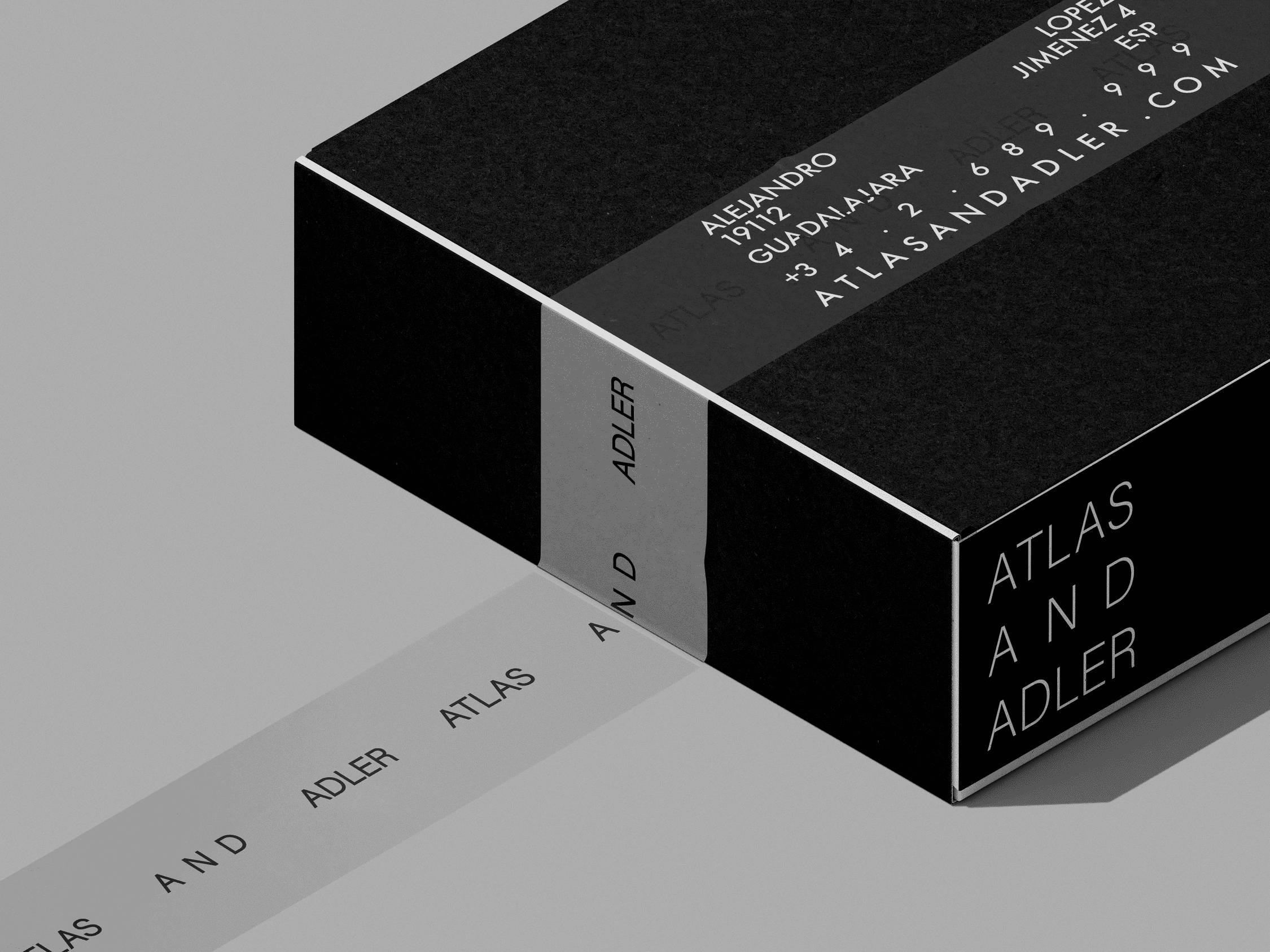
We began by crafting a typographic logomark that felt structural yet elegant—a visual nod to both architectural precision and editorial refinement. The core identity leans on high-contrast serif and sans-serif type combinations, a strictly monochrome palette, and geometric layouts that echo garment tags and signage systems. From the logotype, we expanded the language into: A modular packaging system that reads like a storyboard Polaroid-style compositions that emphasize form and story Subtle tactile finishes (uncoated stock, folded edges) to bring the physical experience in line with the digital tone Narrative copy placements (“Visual Identity, Summer 2025”) designed to make each artifact feel like part of a collectible series. The brand voice became part fashion editorial, part industrial design thesis—unapologetically quiet, but deeply intentional.

The final identity system for Atlas & Adler isn’t just seen—it’s felt. It’s in the way the packaging unfolds, the way the bag carries posture, the way the type sits on space. Through our collaboration, we created more than a brand—we built a visual language of masculinity in its most distilled form. This is the kind of branding that doesn’t shout. It stands still and gets noticed.