
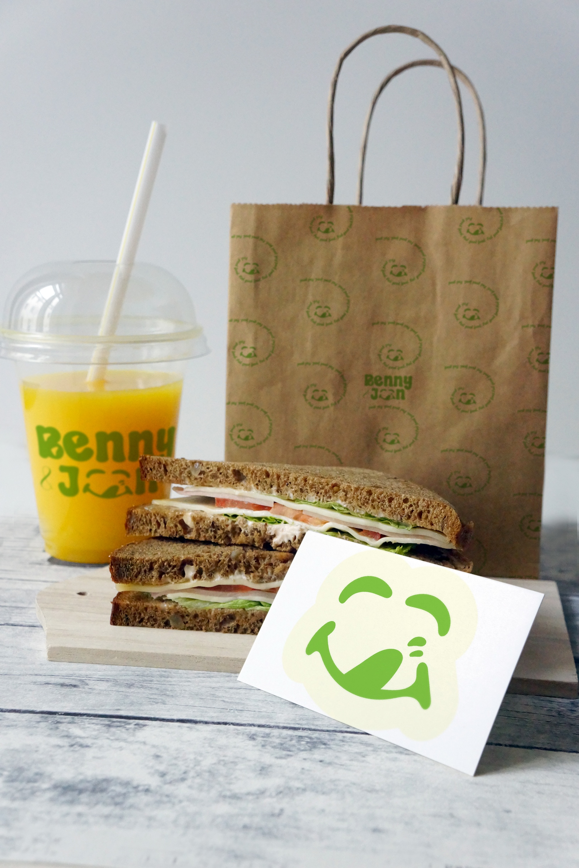


The design of the Benny & Joon logo was carefully crafted to reflect the brand’s core values: freshness, joy, and authenticity. We approached the design with a fun and approachable aesthetic, ensuring that it would evoke a sense of happiness and satisfaction—just like the experience of enjoying a great meal. ✔ Custom Typography with Melting Cheese – The logo features a customized typeface, where we incorporated a melting cheese effect in the middle of the B & J to highlight the cheesy, indulgent nature of Italian cuisine. ✔ Color Palette – We selected green and light green as the primary colors, symbolizing fresh ingredients, organic produce, and a vibrant dining experience. These shades enhance the brand’s natural and healthy appeal while staying aligned with the Italian culinary theme. ✔ Smiley Face Logo Mark – To further bring Benny & Joon’s personality to life, we designed a smiley face logo mark, representing the joyful feeling one experiences after enjoying their food. This element serves as a universal symbol of happiness, making the brand instantly recognizable and emotionally engaging.

brand identity for Benny & Joon is a seamless blend of playfulness, authenticity, and freshness. From the cheese-infused typography to the inviting color scheme and smiley logo mark, every detail contributes to a brand that is welcoming, fun, and full of flavor. Whether it’s a quick bite or a leisurely meal, Benny & Joon promises an experience that leaves customers feeling satisfied, happy, and eager to return.