
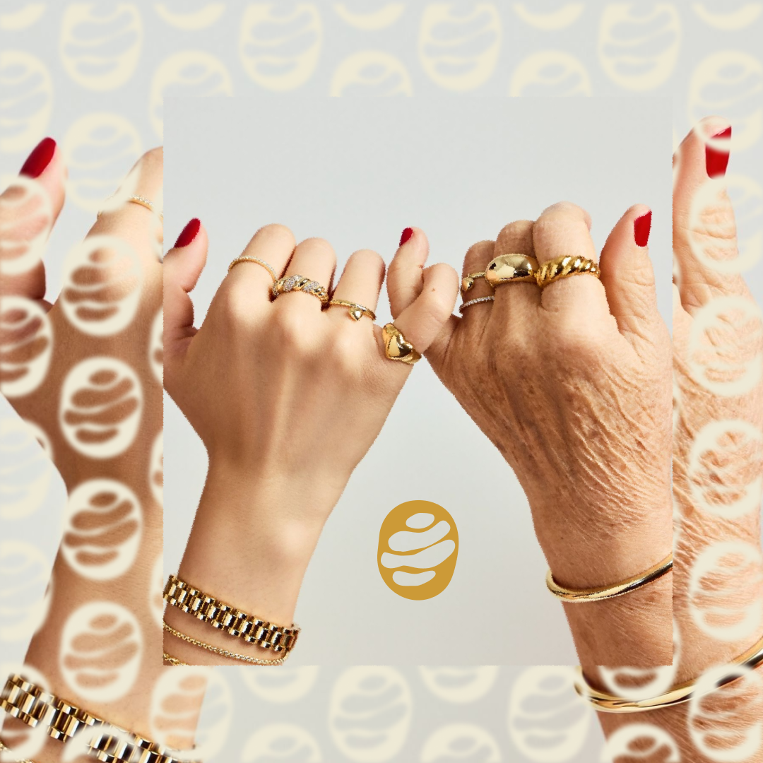
Key Challenges Balancing Spirit & Sophistication The client wanted to celebrate college sports culture without feeling overly casual or novelty-driven — the designs had to work for both spirited events and everyday wear. Making Charms Feel Modern Charms can often feel nostalgic or juvenile; the brand needed a fresh, fashion-forward interpretation that resonated with Gen Z and young Millennials. Multiple Use Cases The jewelry had to look equally at home layered on campus, worn to the stadium, or paired with evening attire.
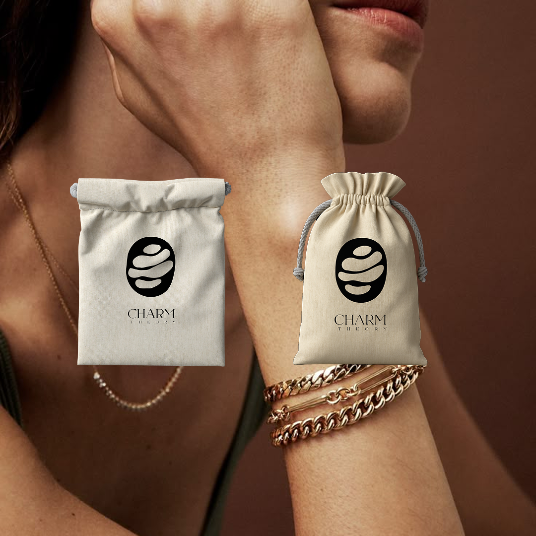
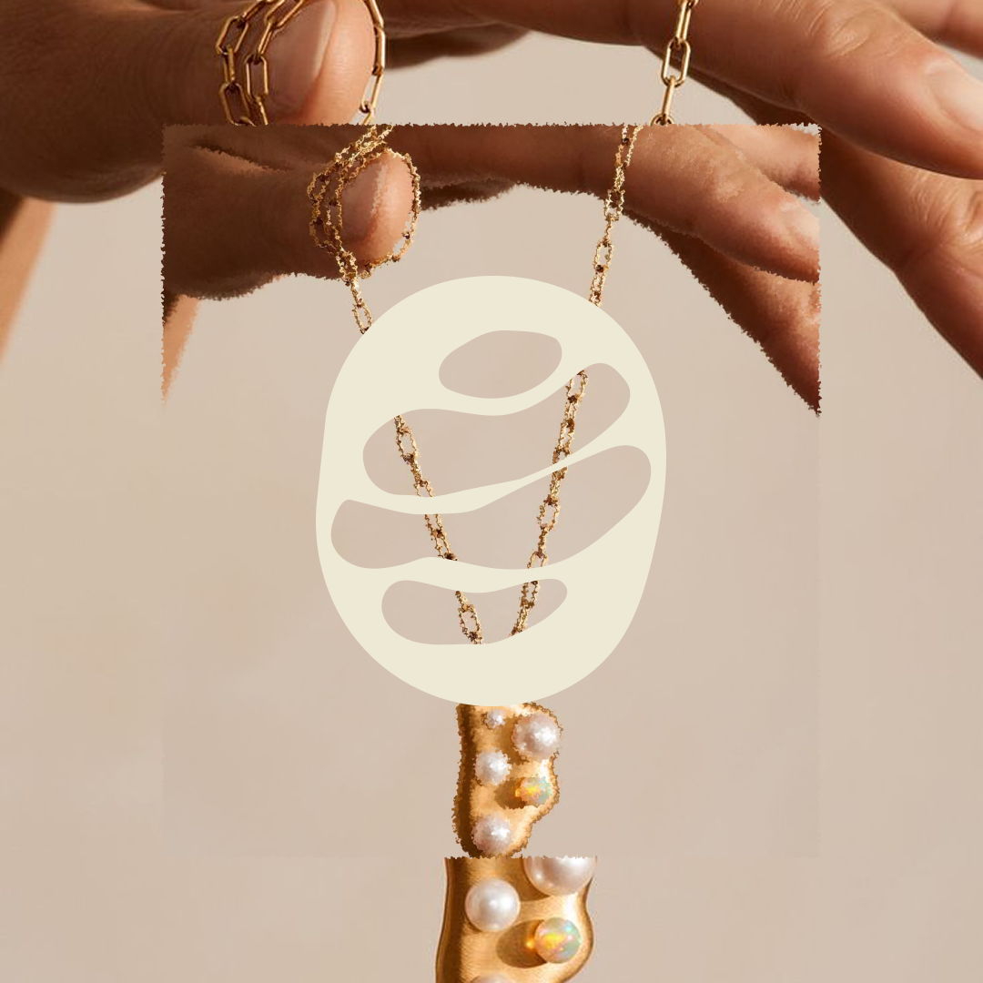
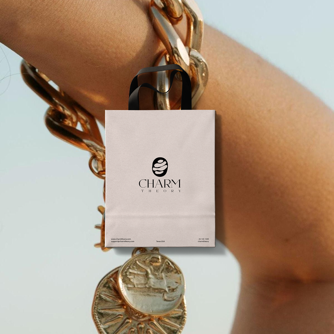
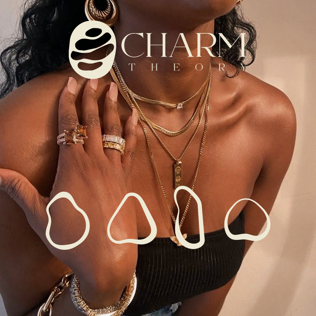
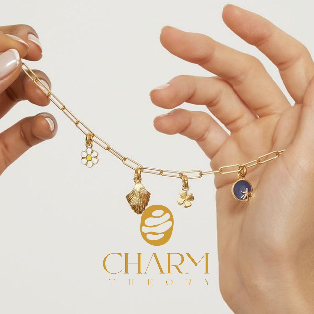
Brandmark: The Modern Emblem The mark is an abstract, fluid form inspired by organic stone stacking and layered shapes, symbolizing stories, moments, and connections building on each other — just like the charms in a collection. The fluid lines also nod to movement and adaptability, echoing the brand’s shift from sporty to sophisticated. c. Typography Pairing for Versatility The word CHARM is set in an elegant serif, giving it a timeless, refined quality. The word THEORY is in a spaced, minimal sans-serif, balancing the classic elegance with a modern, approachable edge — a visual cue for the brand’s ability to live in both sporty and chic worlds. d. Color Palette for Warm Luxury We built the palette around neutral beige and warm gold tones to reflect luxury and approachability. This palette connects with jewelry’s metallic warmth while working seamlessly across print, digital, and packaging.Charm Theory now stands as a modern, versatile jewelry brand that blends youthful energy with timeless elegance. The name, logo, and visual system create an instantly recognizable identity that resonates with its college-aged target audience while appealing to style-savvy buyers beyond campus. The brand’s storytelling-first approach — every charm as a piece of personal history — ensures that customers connect emotionally while enjoying ethically crafted, high-quality jewelry.