Key Challenges Naming Direction Unclear The client wasn’t sure how to find a name that felt rooted in Korean heritage yet emotionally resonant for an international audience. How to Communicate Floral Ingredients Without Being Generic Most skincare brands claim to include florals; the client wanted a more visually unique, subtle, and refined way of communicating it without relying on clichéd floral illustrations. Texture Communication The product had a silky, water-light texture—the client wanted this tactile experience to be visually felt through packaging and branding. Differentiation in a Crowded Market K-Beauty brands are everywhere, and many use flowers and water themes. The brand needed a fresh, minimal-yet-meaningful concept that wouldn’t feel derivative.
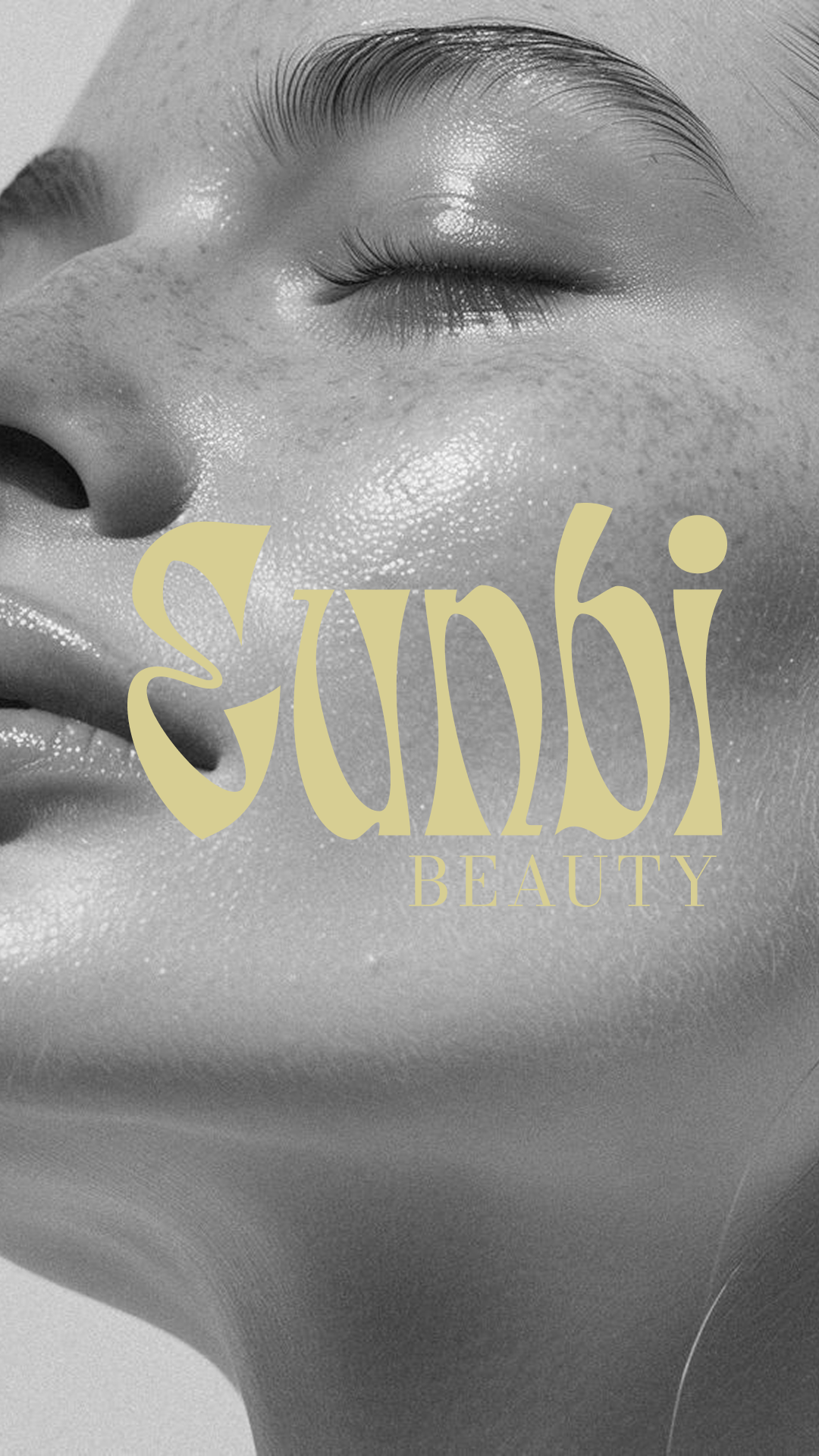
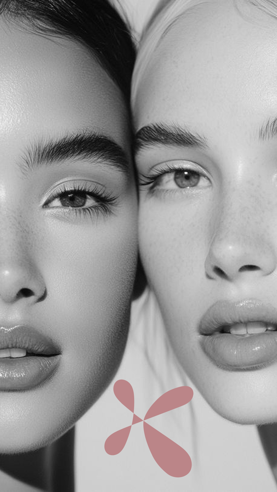
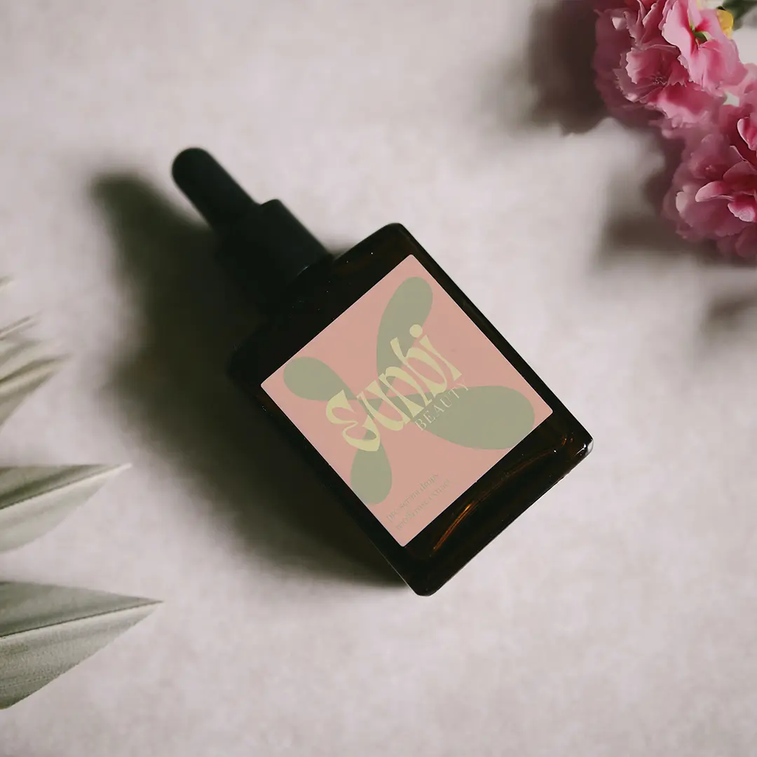
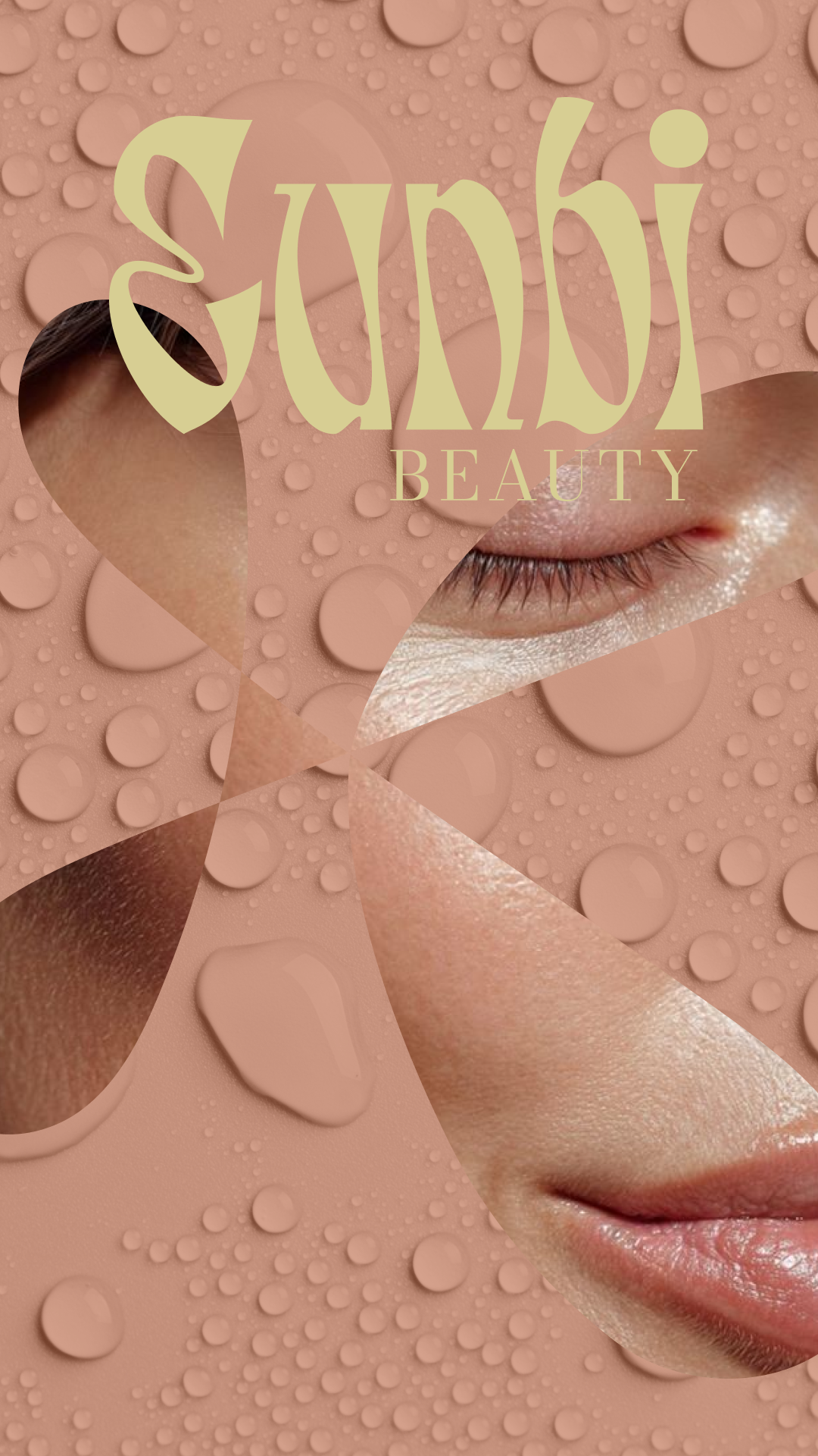
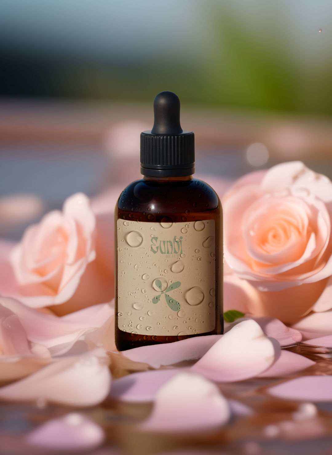
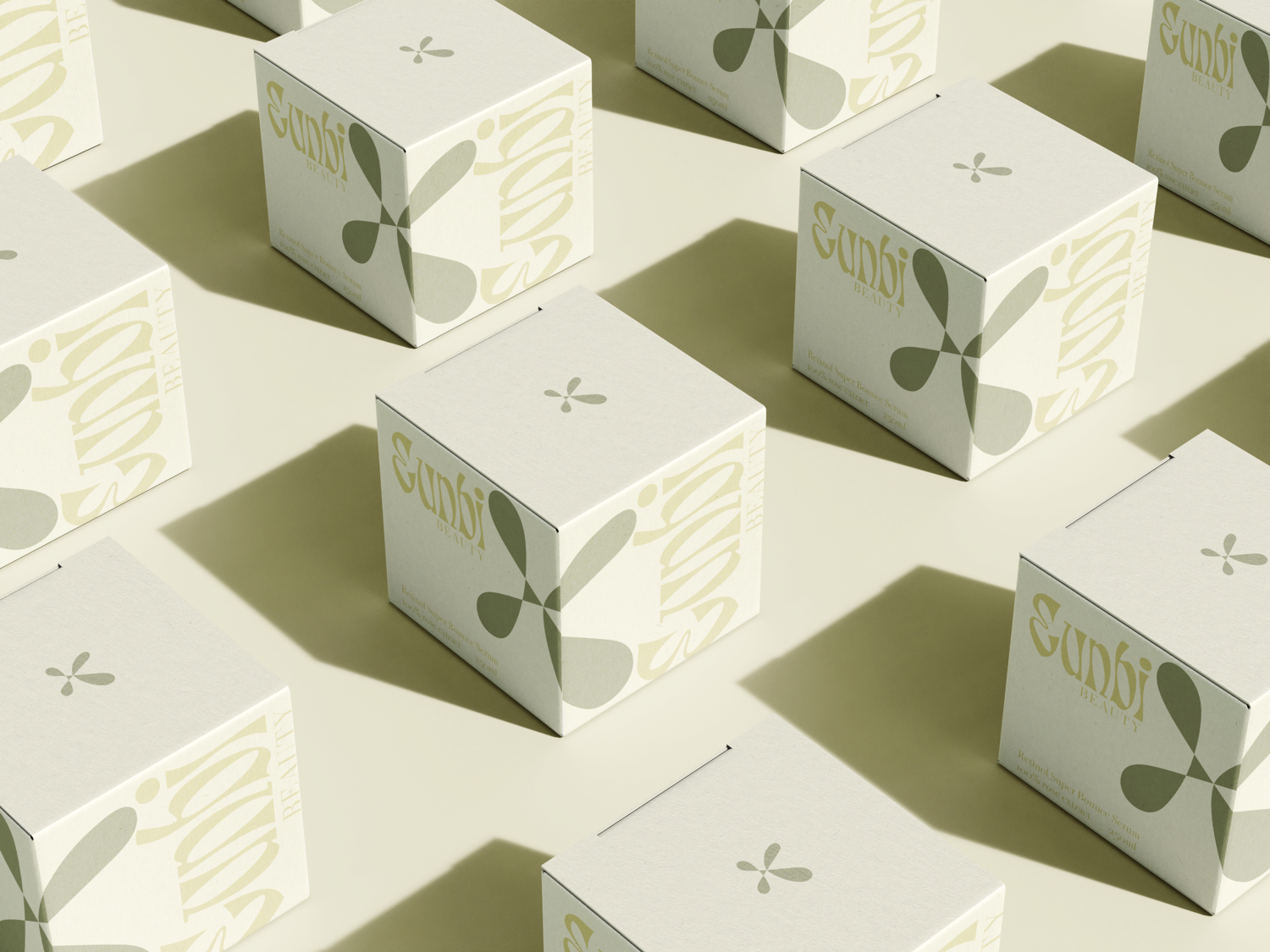
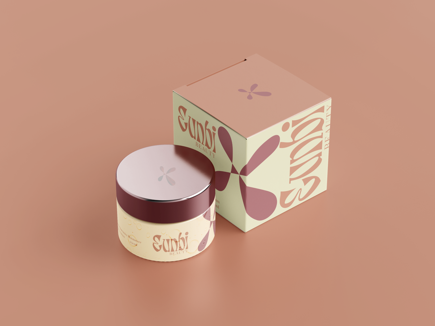
Strategic & Design Solutions a. Naming: "Eunbi" We named the brand Eunbi (은비)—a Korean word meaning “silver beauty”, symbolizing radiance, softness, and purity. It subtly reflects the goal of achieving glowy, healthy skin with a refined identity that feels authentically Korean yet easy to pronounce internationally. b. Brandmark: Petals × Waterdrop To communicate the floral ingredients and hydrating texture, we crafted a custom logomark inspired by the overlap of a flower petal and a water droplet. This hybrid mark became the brand's signature symbol — soft, minimal, and fluid, much like the product experience itself. c. Typography Inspired by Skin Cells The custom Eunbi logotype was carefully constructed to mimic the organic arrangement of skin cells, communicating the brand's mission — to care for each individual skin cell. This abstract concept brought science and beauty together subtly, elevating the brand's perceived intelligence and attention to skin health. d. Color Palette from Floral Ingredients Instead of directly illustrating flowers, we took a refined approach — extracting a color palette from the floral ingredients themselves. Each tone on the packaging reflects a real flower (e.g., rose, lotus, camellia), offering a sophisticated nod to the product composition while maintaining an upscale, minimalist look. e. Texture Visuals through Droplets We used water droplets across certain visual assets and mockups to reinforce the “feels like water” concept. This helped communicate the lightweight, fast-absorbing nature of the products without relying on heavy text or product claims. f. Visual Identity Rooted in Ritual Every visual element — from logo to layout spacing — was designed to evoke a calm, sensory ritual experience, echoing K-Beauty's holistic and soothing approach to skincare.