


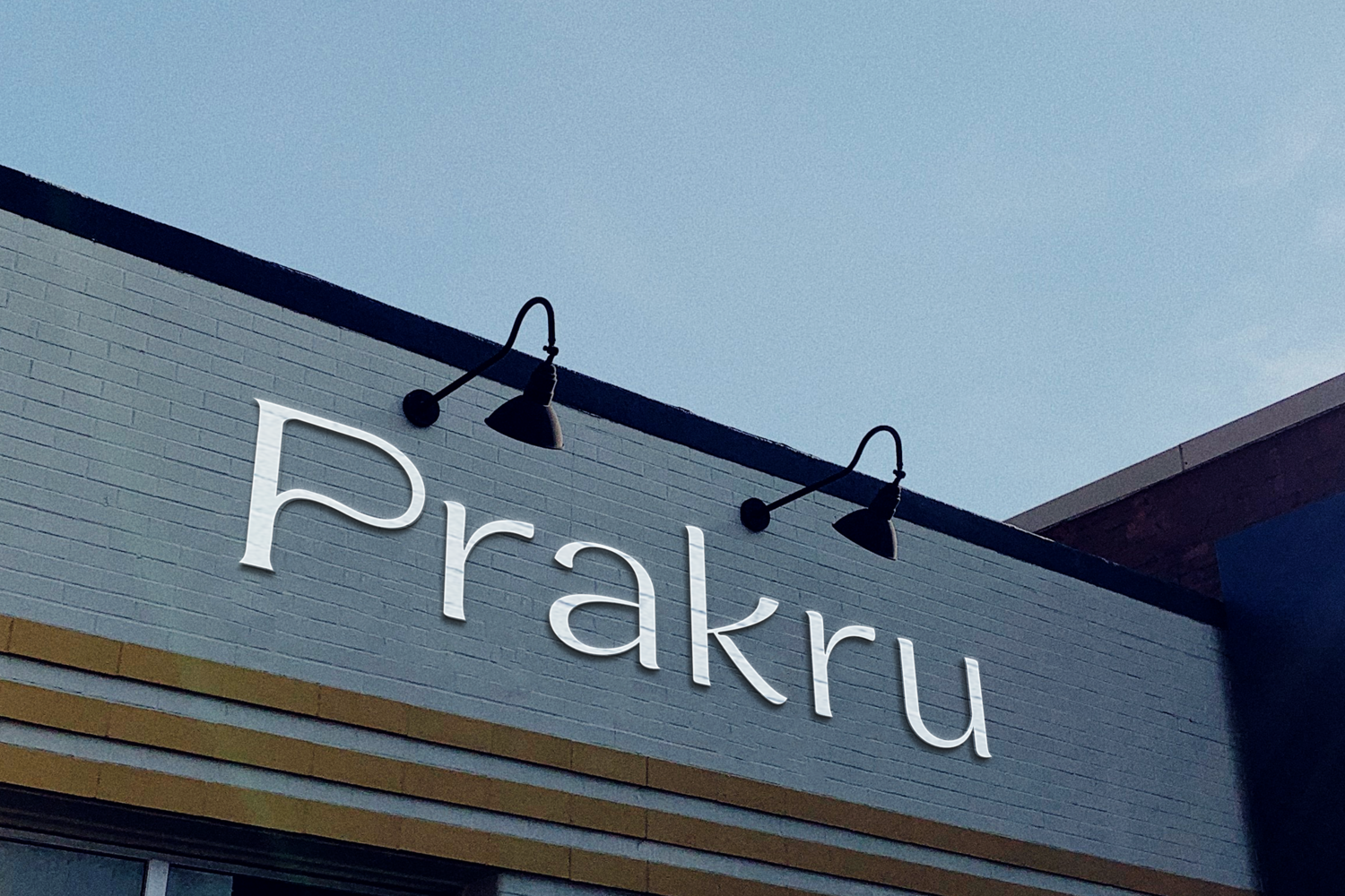

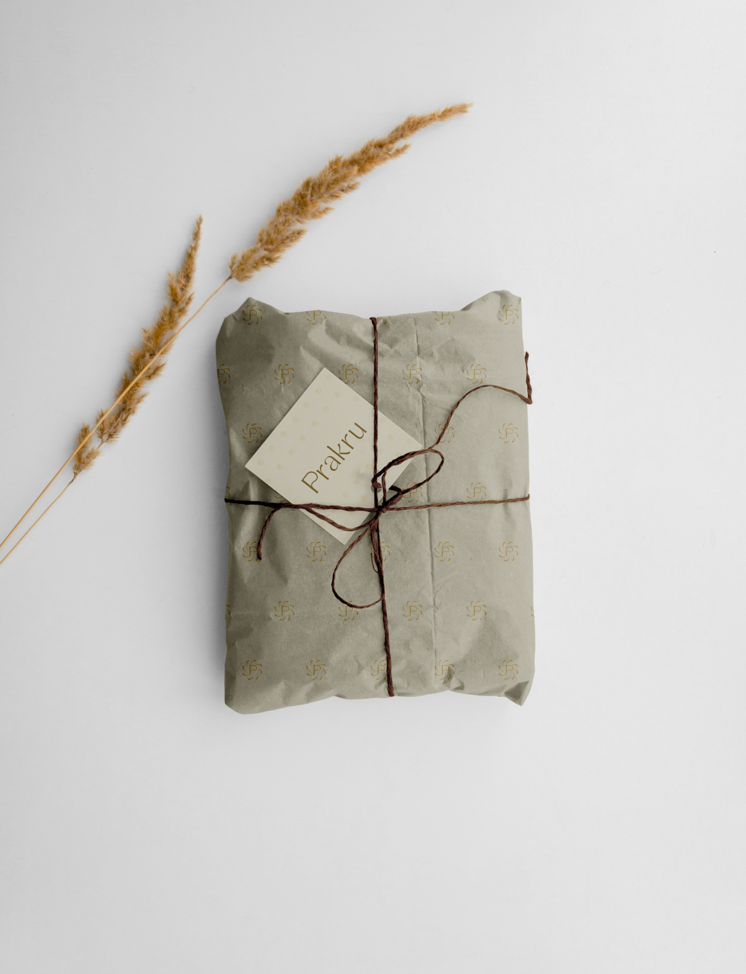
We began by identifying a key opportunity: most sustainable fashion brands leaned either too earthy and raw or overly utilitarian. There was space for a minimalist, elegant, and feminine sustainable brand that speaks to modern women who care about both aesthetics and impact. We developed the name Prakru — inspired by the Sanskrit word Prakruthi (meaning nature) — to reflect the brand’s Indian roots while remaining short, memorable, and international in appeal. The brand identity system included: A bespoke logotype with subtle, leaf-like curves to express softness and sustainability. An earthy yet refined color palette using clay, sage, linen, and charcoal, reflecting the materials (hemp, bamboo, Tencel, and linen). Elegant typography and layout systems to ensure the digital presence feels clean, luxurious, and contemporary. Strategic input on packaging, social tone, and site design — all aligned with the ethos of conscious luxury.

The result is a holistic brand built with intention — where every element, from the name to the typography, tells a cohesive story of refined sustainability. With a strong foundation in place, Prakru is ready to make its mark as a premium, mindful fashion brand for women who believe in dressing with purpose.